
Can you remember this?
Of course you still remember. Covid-19 is (was) a bad story.
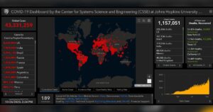
But I wanted you to remember this infographic, associated to Johns Hopkins University, Maryland, USA.
Infographic was already present before Covid, but this rapidly changing process widened the number of presenters and deepened the story telling with changing the focus among the speed of the pandemic, the number of daily new or cumulative cases, the conditions of the recovery or the potential economic impacts including the observed and the forecasted scenarios.
The graphs shown above became a kind of standard. The Johns Hopkins University’s template turned out to be the best balance between the quantity of the information and the simplicity of the presentation for millions of the citizens all around the world.
Was it a result of a good graphical invention alone? Far from it. Johns Hopkins not only created the infographic, but it also provided the database, ‘the’ database which liability was never questioned during the critical months of the pandemic.
They collected cleaned and interpreted the country specific data on the contrary of many terminological inconsistencies (e.g. Hungary reported the weekend data pooled with the Monday data).
The complex and challenging task and the inevitable product was honored by the professionals, too. At the 2020 Esri User Conference, the Center for Systems Science and Engineering (CSSE) at Johns Hopkins University won the Making a Difference Award for creating the Johns Hopkins COVID-19 Dashboard.
It’s absolutly worth to mention the name of Ensheng Dong, a doctoral student from the University, who created the iconic dashbord. Twice a day, he would update the dashboard. “For a month, I barely slept—five hours a day or less,” he said.
Tehnically this dashboard – which requires a very strong location-based analytical support – was created with the help ArcGIS. This technology is open for you, too. Go there and create your own dashboard! But if you are already familiar with R, because you already use it for data manipulation, analysis or visualisation, you can remain within the R framework – and all the benefits of ESRI models are still available for you.
How does it work? You can set-up a R-ArcGIS Bridge within the ESRI community, find here.
So you can easily extend R with ArcGIS or or vica versa you can enhance analysis with R in ArcGIS. There is a nice video on crime cases [of San Franciso] analyses where the strengths of R and ArcGIS are pooled together.
So if you liked the Johns Hopkins’s dashboard then we have a good news to you: with some – not too deep – technical affinity you can create your own dashboard templates combining the capabilities of ArcGIS and R.